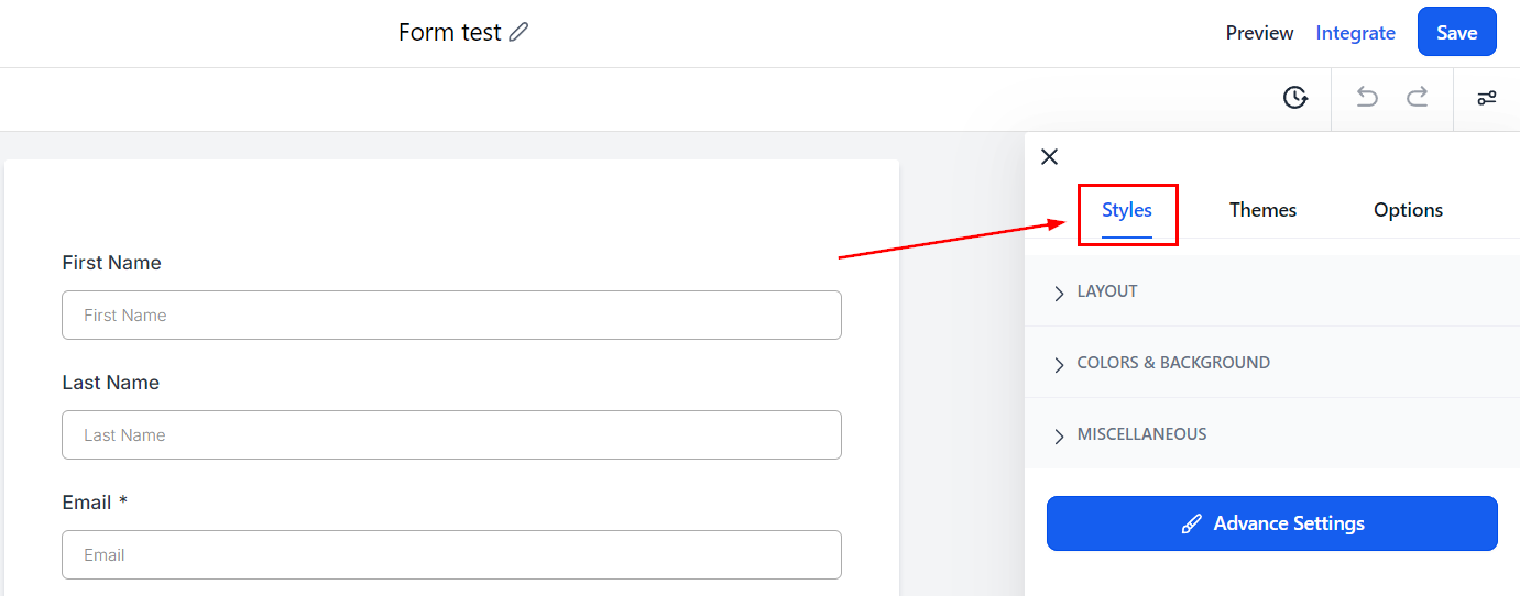
Styles Tab
To alter the visual aspects of your form, navigate to the Styles Tab within the form builder. In this section, you can tailor the appearance of your form by adjusting elements such as colors, borders, and additional design features. Customizing the look of your form allows you to create a cohesive and aesthetically pleasing user experience that aligns with your brand identity.
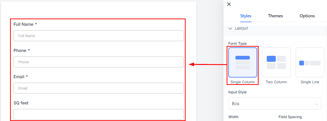
Layout
Here you will find your form layout settings, meaning the way the fields will be spread across the form.
Form Type
The form type will be the orientation for the fields. The three types are:
Single Column: This will be a vertically streamlined version of the form, all fields will have a width of 100%
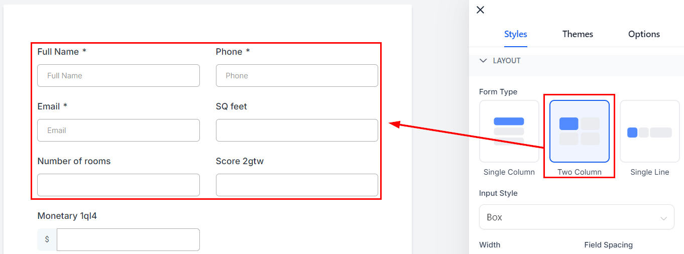
Two Column: This will break down your fields into two columns, the split between fields will be 50% by default.
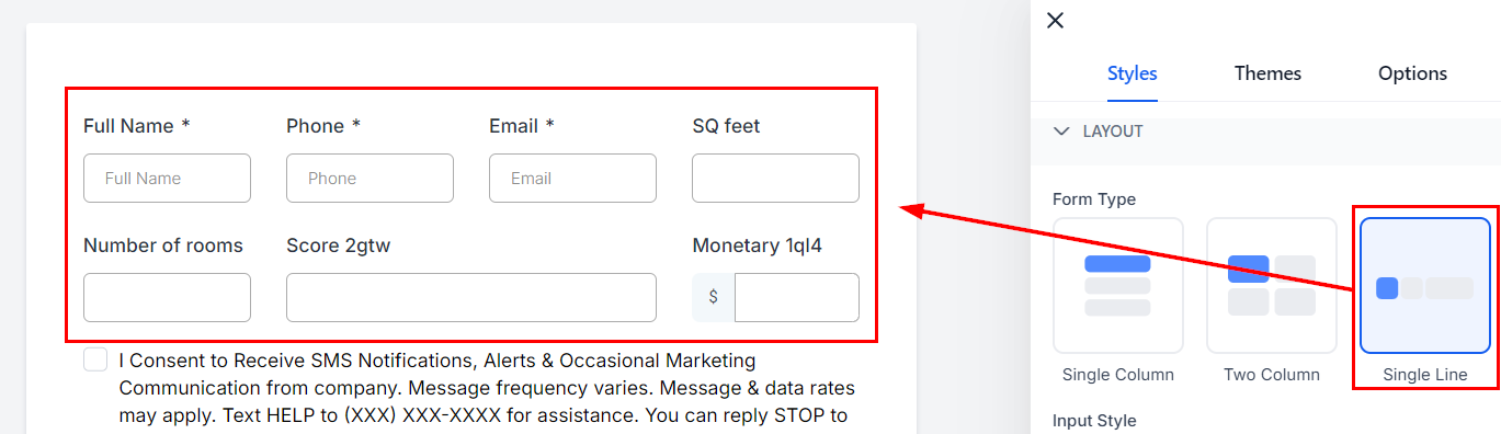
Single Line: This will have as many fields as possible in a single horizontal line, this version allows you the most control over how many fields and how wide they are inside the setup.
Input Style
With the Input Style, you can change the appearance of the fields.

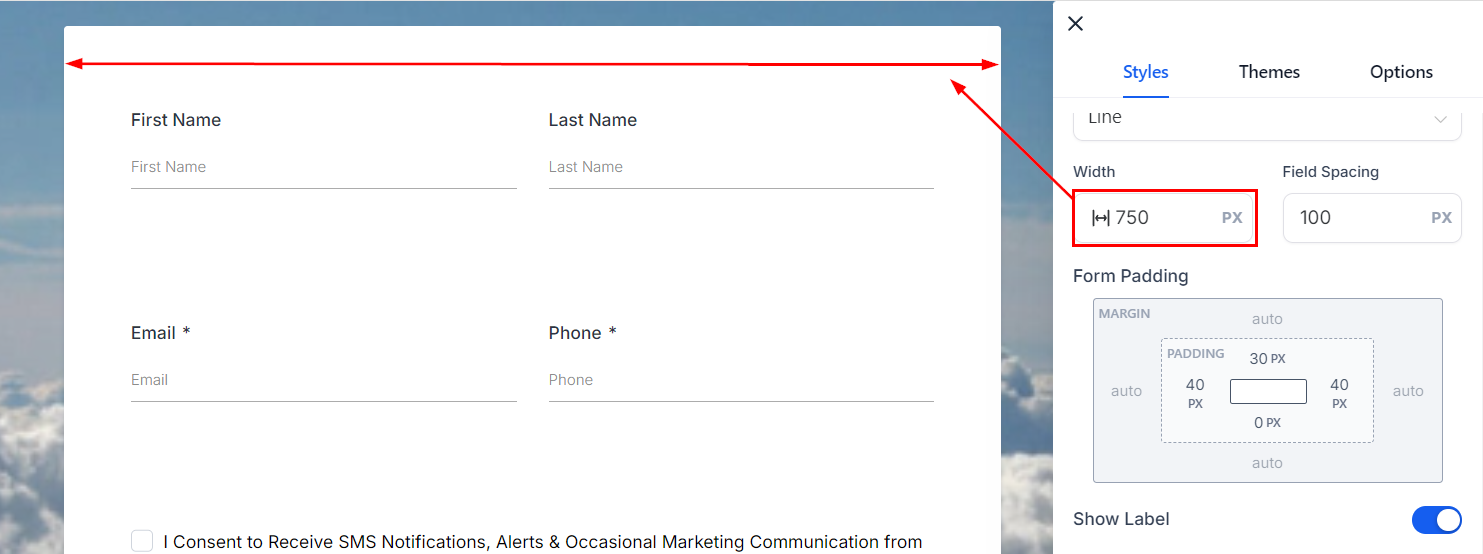
Width
Modifying the form's width is also possible by adding a number in the given field. The higher the number, the wider the form will be.
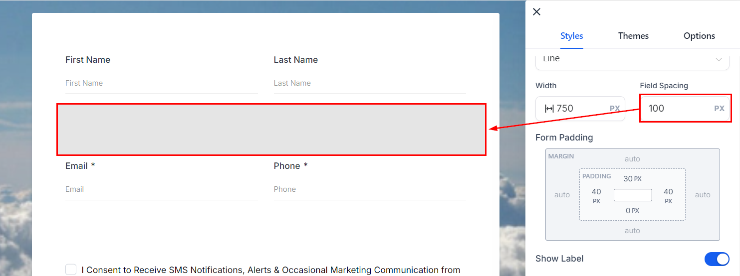
Field Spacing
This number will determine the space between the field lines.
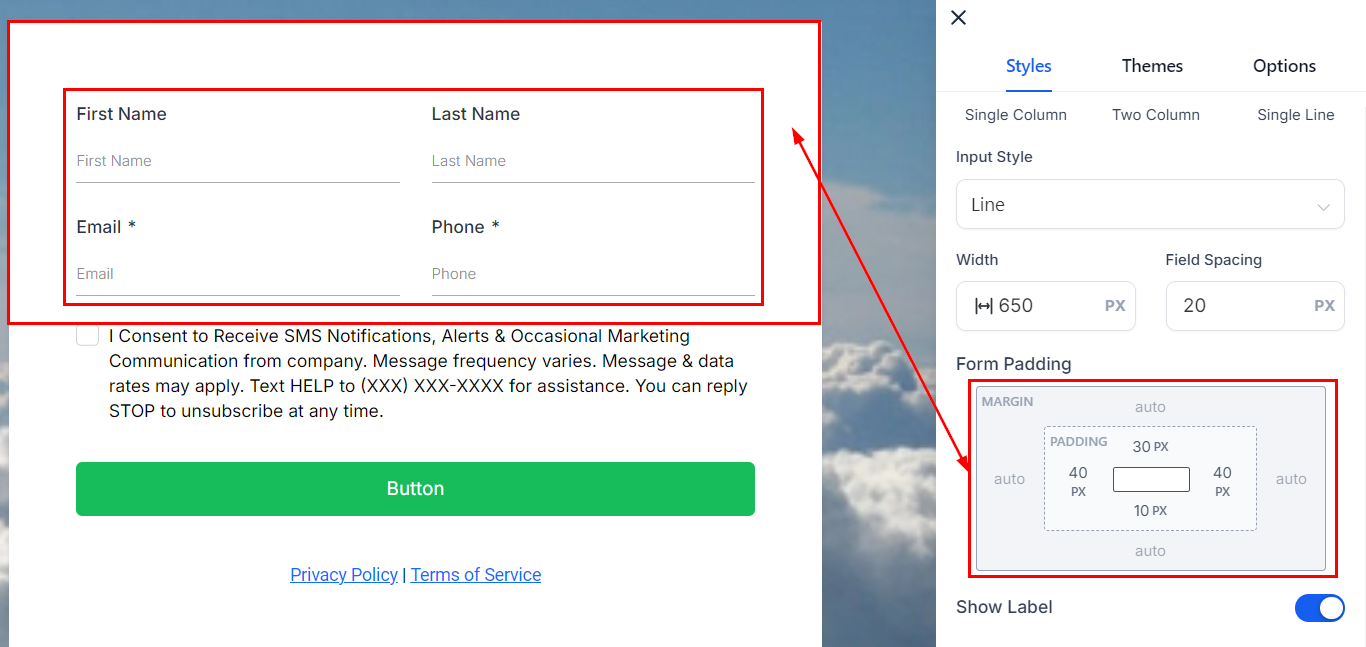
Padding
The padding adds spaces to the form so the elements are not on top of the margin or too close to the edge. These four (4) different padding fields move the Form to the left, right, top, or bottom depending on the field you add padding. Simply type a number into the given field to add padding to the top, bottom, left, or right based on your preferences.
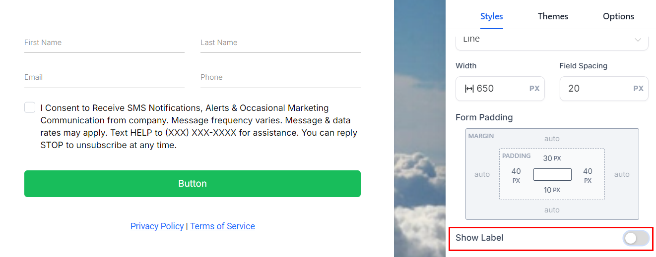
Show Label
If you want the field label to be hidden disable this option.
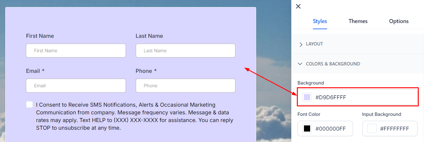
Colors & Background
Background
To change the background color, click on the color box and select a color or add a custom code, this will affect the general form's background.
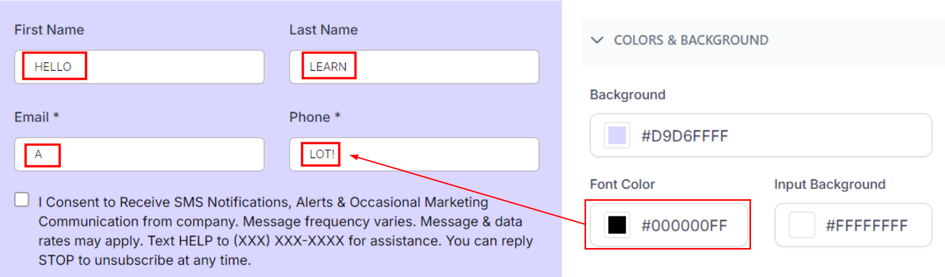
Font Color
This will modify the font color user responses have when data is entered. You can see it by previewing the form.
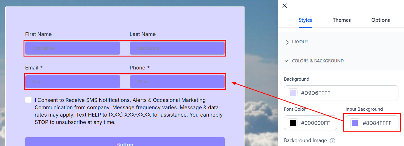
Input Background
This will change the background color for the response fields.
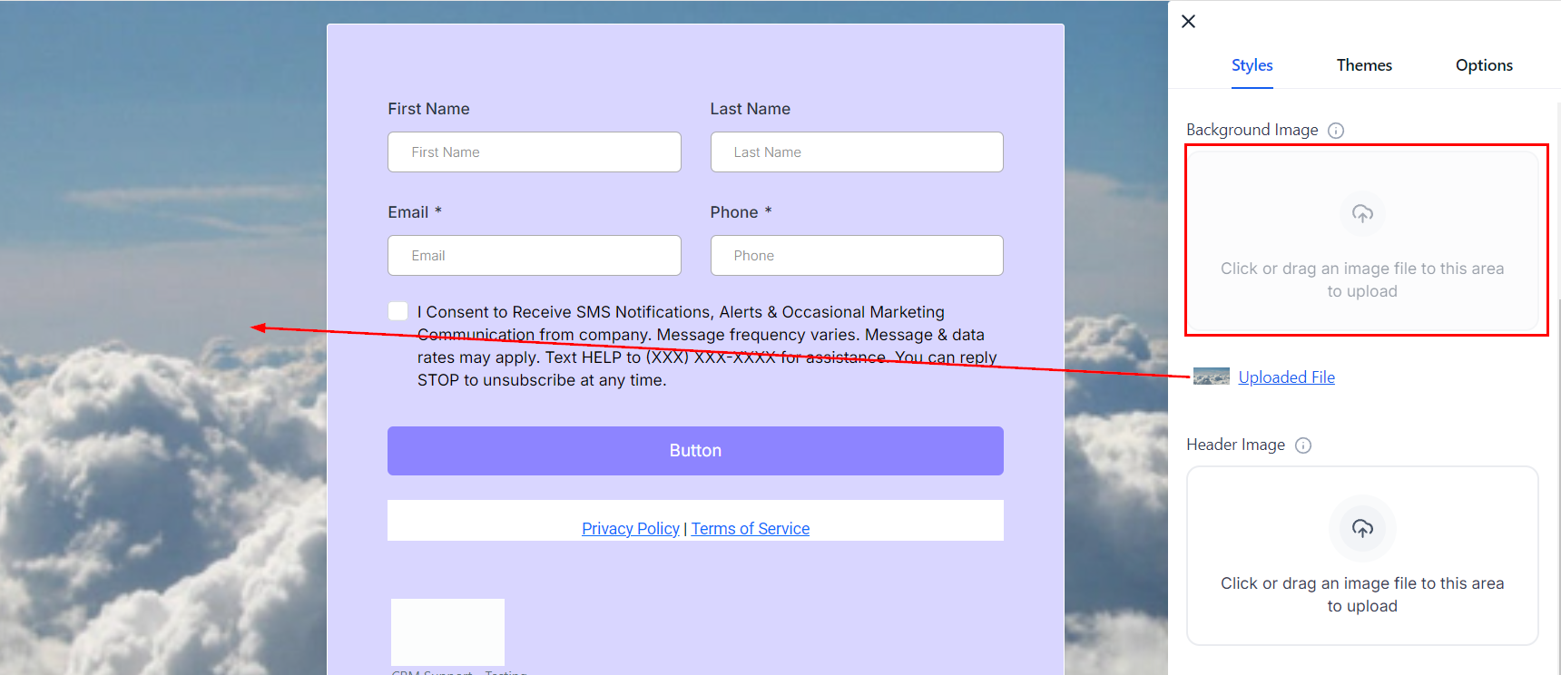
Background Image
The background image is intended to cover the entire page, providing a visually appealing backdrop for the form.
Header Image
The header image is designed to cover the entire width of the form and remains positioned at the top of the form.

Miscellaneous
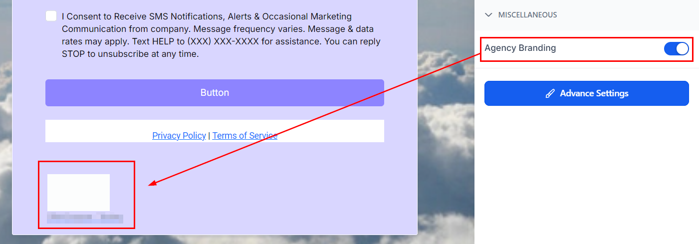
Agency Branding
In the Miscellaneous section, toggle on or off the company Branding option to show or remove agency branding at the bottom of your form. Turning it off allows you to place your form on a different funnel from the agency's.
Advanced Settings
Here you can configure the look of the forms further, allowing you to get detailed with your changes.
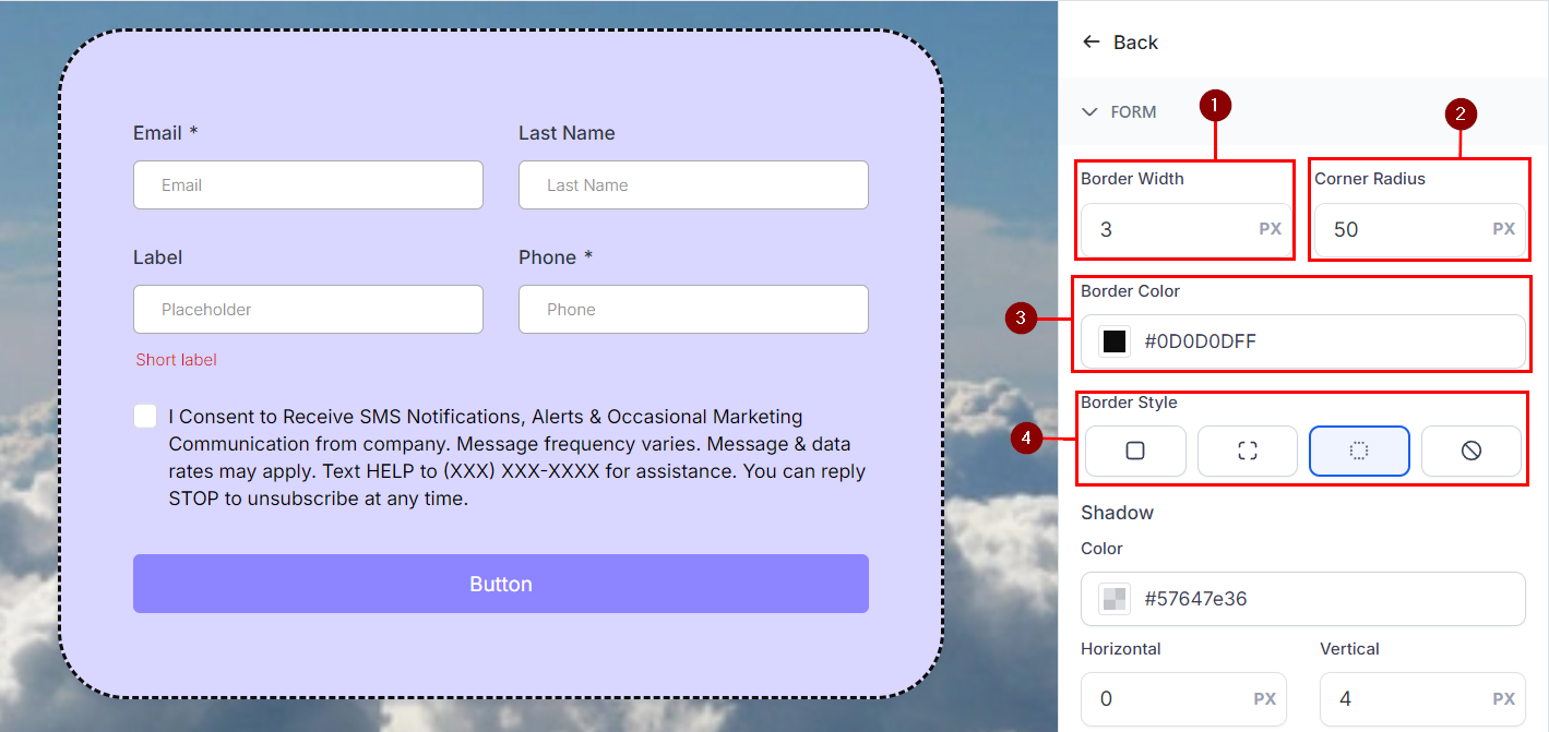
Form and Input Field.
This allows you to modify the look of the borders and surroundings of the form and its input fields. The modifiable options are:
Border Width: To add thickness to the border lines.
Corner Radius: To round the corners of the borders, you get a rounder corner the higher the number you input.
Border Color: This allows you to modify the color to your liking.
Border Style: Here you can modify the look of the border or remove it altogether.
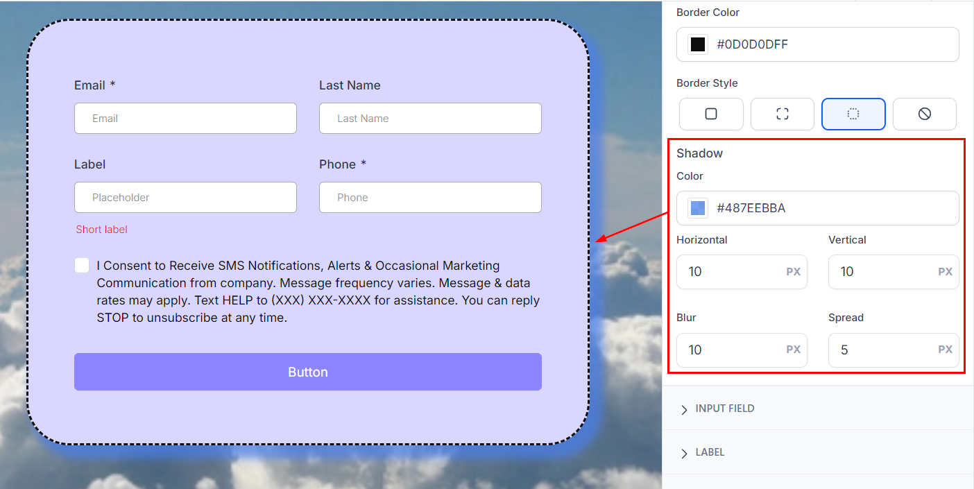
Shadow: These options allow you to give additional depth to your form/fields. The horizontal and vertical fields set the size, Blur sets the opacity, and Spread limits how far the shadow should extend.
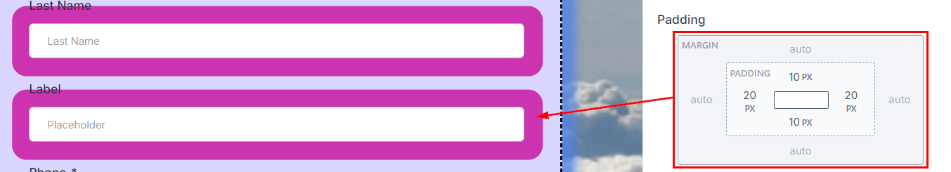
Field Padding: This adds space between fields to prevent overcrowding in the form.
Label, Short Label, and Placeholder.
These sections allow you to change the font and its color, size, and weight for the text inside the Form. The label will be what shows on top of a field (1), the short label will show underneath (2), and the placeholder will show inside a field (3).

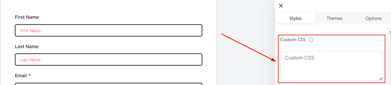
Custom CSS.
You can add custom CSS to your form in the Custom CSS box to modify the design of your forms, such as input fields' shapes, colors, buttons, and more. Consult with a web developer familiar with CSS if you are unfamiliar with this option.
Last updated